A lot of people who work with books take book covers kind of personally. It goes like this:
One part "I love you I want you to look beautiful and cool"One part "Don't make me look at your lame design"
5 parts "How do you expect me to sell this book when it looks like that?!"
Shake over ice, strain into a pitcher. Guzzle.
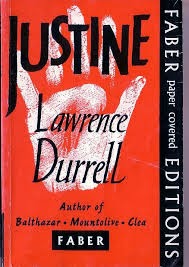
Leading to a profound sense of personal betrayal when one of your favorite authors ends up between the covers of something that looks like this:

Eeeuuurrgh. That poor man. He's Canadian, maybe that's why his publisher thinks that a murky 90's constructivist/disco album cover is the way to go. That thing looks like (the Human League) + (Stalin - mustache) x (abandoned on a roof).
The book cover trend I've had my eye on recently is graphic illustration - I mean graphic like simple shapes, not graphic like a knife through an eyeball. Like this:

SO FAB, am I right? Clean, streamlined. Plays well with type. Plus it's like a visual puzzle - your brain needs to resolve those two big black circles with the chopped-up brown semicircle and the underlying oval to make - ooo! a face! A sort of retro, minx-y face at that.
Graphic covers always have kind of a retro look. It's the modernism thing. There are a ton of totally iconic book covers from the mid 20th century, when Modern was modern. Check it:


Many of these are iconic because of their strong graphic illustrations. There is no other cover of Catch-22. You could argue that some of these are type designs only - the Rabbit books and 1984 are a little low on graphic elements - but I would come back and say that the broken parallel lines that describe a surreptitious circle on the Updike books are totally illustrative of the dissonance in those novels, and the fat, aggressive type used on the Orwell cover is a picture in and of itself. It's practically a sculpture.
I love the current descendants of these covers. OBSERVE:


So much color, so much shape. What does it say? It says this book will be uncompromising and hard-edged. Maybe this book will be short stories, in which case a quilt of similar geometric shapes is a good choice. Maybe this book has something to do with fascism, or is set in a culture that eschews representation in art. Maybe we've chosen abstract or semi-abstract shapes for the cover because the book deals in abstractions. Or maybe we've chosen lines - criss-crossing for Jim Gavin's Middle Men, spiraling on the Christopher Reich cover - because they describe the plot.
Melville House has a a lock on this style right now. In addition to serving up an entire series of books the covers of which feature silhouettes (remember last post?) against delicious solid color backgrounds, resident designer Christopher King also cooked up some masterful minimal illustrations for Marek Krajewski's Inspector Mock series:


These are clearly playing off a sort of Eastern European Bolshevik Modernist style - witty and eye-catching and sort of decadent and gritty at the same time. Somebody at Huffington Post likes them so much they interviewed the designer about them.
Here are some other beauties from Melville House:


Then there's black and white. People are always hitting the black and white. Man, when black and white is great it is iconic.

That's taken from a diagram of something having to do with a pulsar, if my recollection of my college-age fanatically encylopedic knowledge of everything having to do with Ian Curtis ever ever EVERRRR is correct. It's magnificently, viscerally pleasing, and inspired a thousand imitations:


Now, I own kind of an unusual number of capes for a 21st-century non-Renn-Faire-type person, but WOW I think I need another cape.
Even when black and white is not for-the-ages fabulous, it's still striking:


But LOOK AT THESE NEW COVERS FOR JAMES BOND. A favorite library customer pointed these out to me, and while I have, um, you know, probably


Joy Division cape, new set of James Bond paperbacks, this is getting to be an expensive little post. Let's go for broke - I WANT THESE TOO:


Happy weekend, everyone! Read good books with attractive covers!
No comments:
Post a Comment