1). NO MAS. The handwritten title. NO! MAS!
THESE. With their klutzy lower-case cursive r's and their anemic a's and l's. And they all look alike. Don't you think it is weak design to just scrawl the title across the front of the book? It is weaker still to use that tilty skinny faux-handwritten title typeface - maybe you know the one? I call it Oliver Jeffers Handwriting Corrupted by Barry Sonnenfeld Credits Display Face.
 |
| This is the typeface I mean. Oh look, the title forms a star. There wasn't ANY other way to have done that? |
BUT THERE'S SO MUCH MORE...


I blame The Marriage Plot. Because a) it's always nice to have something to blame and b) it's always nice when that something is Jeffrey Eugenides. Why pick on Jeffrey Eugenides? Because I kind of love him. He's from Detroit, he studied with John Hawkes
 |
| 2013 Cover Trend Villain of the Year Jeffrey Eugenides with Noted Villainous Voice NICK MOTHERFUCKIN CAVE. How did that come about and why did nobody invite me? |
But WHY the handwriting? Is it meant to bring a hand-crafted touch to the cover? Or make it look kind of endearingly sloppy and manuscript-y, as if Paul Auster's assistant just dropped it off at his editor's office? If it were even NICE handwriting, as on the cover of The Virgin Cure, I could sort of see it. But Mr. Penumbra's? Come on. Even the most eccentric of bookstores would have a sign out front that didn't look like somebody'd scribbled it on the back of an envelope.
 |
| AND she's turning her head away. Yeesh. |
Maybe I have a particular axe to grind against this trend because I earned extra cash in high school as a calligrapher. AND THIS IS THE WORST CALLIGRAPHY EVER.


NUMERO DOS: I am boycotting the torn paper thing starting NOW. Well, starting after I read Alex.
This is a trend that I fear is just getting its legs under it, so I'm getting a jump on being sick of it. The success of The Goldfinch is going to inspire copycatting (please note also the handwritten damn title of The Goldfinch and you'll probably discern the reason why I don't feel like I have to read that book) (plus it's like 9 hundred pages long).
And of course it is superficially kind of brilliant - what's not to love about trompe l'oeil - plus the visual metaphor of What Lies Beneath the Page is just gonna be irresistable to designers, especially designers assigned creepy fucking things like this one:

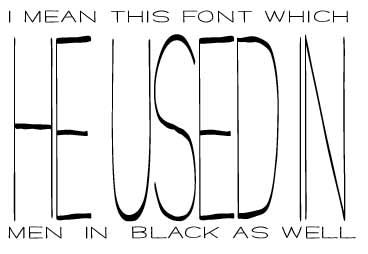
THREESIES: Boys and girls of the publishing industry, if you want library and bookstore staff to be able to locate your author's book on the shelf, you will not use frickin CURSIVE for the title on the spine:

That is all.
IV). Maybe I'm the only one who sees this kind of thing all the time, but probably not:


Double check to be sure there isn't an existing book cover that looks just like the one you're planning before you print half a million of 'em.

No wonder I can spell it, it smacks me in the face every time I traverse Adult Fiction.
6). God, and frankly? I have never been ok with "a novel." Even when your title is "The Execution of Noa P. Singleton," I don't need the clarification. I'm still not going to mistake it for long-form journalism. Or a self-help book, or a board book, or a bag of oranges.

OH IT'S A NOVEL - THAT'S PROBABLY WHY IT'S SHELVED IN FICTION AND NOT WITH THE DVD'S.
AND TWO THINGS I LIKE:
I. I have to admit, I am enough of an Etsy addict to have kind of a visceral attraction to silhouettes. And there are a lot of them out there recently, enough that I think I'll probably get good and sick of em before the trend is over.


Look at how it is particularly deployed in the service of kids' historical fiction and YA. Interesting. It's the perfect compromise between showing the character on the cover and keeping the cover generic enough that the reader can project him- or herself onto it. It certainly beats the shit out of cutting the poor face in half at the bridge of the nose.
Extra points for this strong graphic element looking terrific paired with fun colors. You say Havisham, I say fabulous.
2. Also not tired of the return of cool, cool Helvetica and Helvetica-adjacent sans-serif typefaces:


Plain, like on the cover of the new Marcel Theroux (which I, uncharacteristically, might have to read - I loved Far North: A Novel ) (not to be confused with Far North: A Minnesota rye whiskey or Far North: An insurance agency oh I'm sorry "a novel" is just SO DUMB), this type is both elegant and gritty. In glowing neon it is inkily atmospheric, luxe and hard-boiled at the same time. Even when it is rendered by hand, in watercolors on The Heart Broke In: A Novel
 or scratched in ink on On Such a Full Sea: A Novel
 (what a great title), it is intriguing as hell, promising no-holds-barred emotion and unflinching drama.
The type itself stands up to rough treatment - distorted by water (Hamid), partially obscured (Pochoda, Aira), degraded all to hell like on the Juan Gabriel Vásquez cover, or as if it's embossed in plastic like a credit card (the Alafair Burke). It is futuristic and nostalgic at the same time. It works when it's big, small, and medium-sized. It makes a long fancy title (The Yonahlossee Riding Camp for Girls: A Novel , How to Get Filthy Rich in Rising Asia: A Novel
 ) easier to read and remember. It makes a short title totally fucking devastating. Benediction
 , indeed. No "a novel" needed for my man Kent Haruf.
A simple, declarative typeface, especially when in the company of a moody landscape, as in the Dubus and the Shacochis, also kind of announces the book as Serious American Fiction. You might notice the colors on these covers favor neutrals, along with various shades of that greeny washed-out blue that shows up so frequently on Literature. Ha: it's robin's egg blue - the Russell Banks cover makes that clear. I think bright color isn't considered to be intellectual, so this sort of polluted blue-green is the color compromise.
Curiously, all-caps sans-serif also seems to be a go-to typeface for books by Asian, African, and Latin authors. Perhaps the association is to the International Style of early 20th-century architecture. I'm going to be staying in the PSFS Building (now a hotel) during ALA Midwinter, and that pre-Mies International Style skyscraper is famously topped by a beautiful piece of sans serif type.

I think the typeface itself can be over-relied-upon, at which point a cover tips over the edge into Way Too Austere. Look at that Roberto Bolaño book. It's POETRY. The cover is black and white and has some kind of superfast photo of, what? a projectile's turbulence? Yeah probably NOT. And the Julian Barnes, Levels of Life ? That is the least lively cover I have ever seen. Levels of life if we're talking THE STRATIGRAPHY OF A GRAVE, sure.
I am betting this trend found its wings when Gone Girl topped the charts. And do I spy an edition of This Is How You Lose Her
 illustrated by Jaime Hernandez? WANT THAT.
But that's all I have to say about book covers tonight.
And listen to me, right? Because I just can't help myself, I need to share a drink. When our hipster pope Junot Diaz is in NYC, he goes to Maharlika and has a Pacquia Punch: Santa Teresa Gran Reserva rum, homemade ginger syrup, lemon, pineapple, absinthe rinse. Want that too.
No comments:
Post a Comment